Can we use Google Street View images in regression models?
The first nation-wide case study in the United States
Happy Monday!
This is one of the first papers that use Street View imagery to develop a regression model to understand air pollution across the contiguous United States. Typically, when building land use regression models, we use categorized land use maps as input variables into our statistical model to predict the output variable (which is often air pollution concentrations). These maps are developed using high-resolution satellite imagery and some sort of classification algorithm. What if we could do this with Street View images instead?
That’s what this research aims to do - and based on their results, they do it well!
What are the benefits of using Google Street View images?
Well, Street View images may provide a higher-level understanding of surrounding land use conditions in comparison to typical, aerial imagery used for land use classification datasets.
For instance, a land cover classification may classify a neighbourhood block as urban or suburban. However, a street-view image may include additional details that could influence the model results and allow us to better understand the micro-level impact on air pollution, such as a tree canopy height or small areas of green space within a highly urban area.
With the growing use of machine learning and deep learning techniques in air pollution research, the use of Google Street View may become more prevalent as input data in regression-based modelling techniques.
How did they build the model?
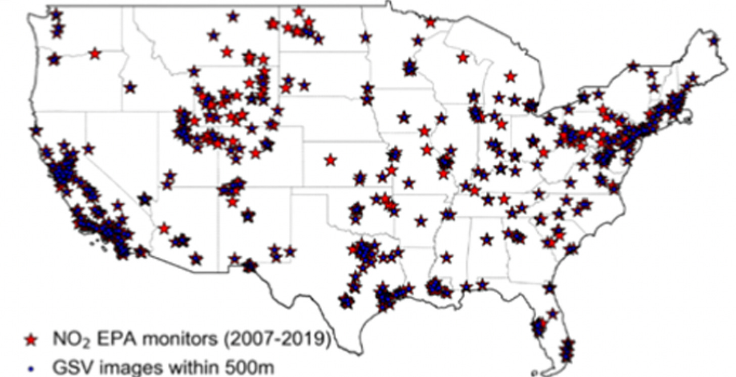
First, they needed ground-level nitrogen dioxide measurements as the dependent variable - these data came from the ground-level monitors located throughout the United States - they are installed and operated by the Environmental Protection Agency and provide hourly measurements of a variety of air pollutants. They downloaded data from 2007 to 2019. Here are the locations of the monitors:
Next, they processed the Street View images. I broke down the methods section into major steps.
They downloaded more than 300,000 Google Street Images
They had one image for each cardinal direction within 500 m of the EPA monitor. The number of images available varied based on the year and the location of the monitor.
They developed a 500 m grid around the location of the EPA monitor and then subdivided it into a 100 m by 100 m grid to download and assess the metadata of the images. Only images taken within four years of the NO2 measurement were kept
They used an image segmentation deep learning model called Pyramid Scene Parsing Network to develop the following land use categories
built environment
transport network
transport vehicles
natural
vegetation
water
human
Then they calculated the percentage (%) of each feature within different buffer radii
250 m and 500 m radii were the default
Then, they constrained the input dataset using different scenarios:
For example, in the “strict” scenario, they only kept Google Street View images taken from the same year as the NO2 measurement.
In the more relaxed scenario, they have a 1-4 year buffer for the Street View images, resulting in a larger training dataset.
The other predictor variable
They also used satellite remote sensing data of tropospheric NO2 from the Ozone Monitoring Instrument (OMI) as an additional independent variable.
Model-Building
They ran two types of random forest models:
Google Street View variables
Google Street View variables + OMI NO2 Measurements
What were the results?
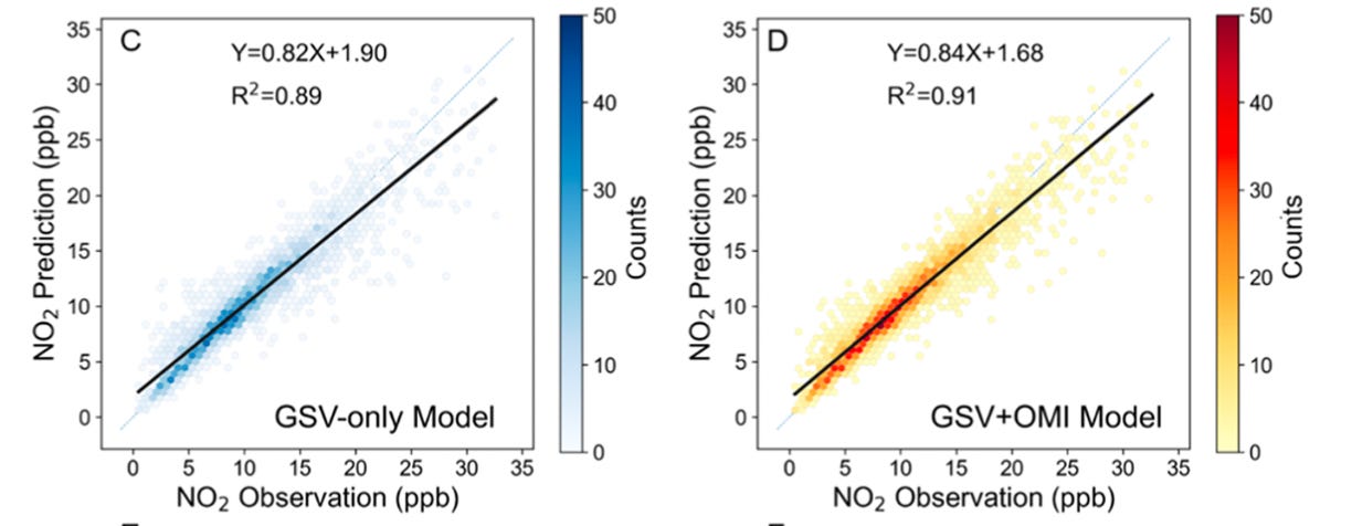
The following images provide a comparison of the observations vs. modelled predictors for the best-performing model in this study.
The paper provides the results of each test scenario, and you should read the paper provided in the link above for these details, but here is a high-level overview:
Air pollution monitors around the Rocky Mountains had the lowest number of Google Street View images
More Google Street View images were available in urban areas versus any other land use type
The model performs best when using a wider range for image inclusion. What this means is that when you include images within a four-year temporal buffer rather than a stick, one-year buffer, the model performs better
The more images you include, the less important the satellite observations became as an input variable. In the “strict” scenario, the OMI measurements increased the R2 by 0.18, but in the most relaxed scenario, it only increased by 0.02.
The traffic-related variables were the more important features in the model.
What’s super interesting here is that the “trucks” feature is ranked as an important variable in this study, highlighting the values that Street View images can provide over traditional aerial images.
This paper provides a clear case study on why Street View images can be integrated into environmental modelling. I’m looking forward to seeing and writing about more case studies that use this type of data.
Thanks for reading! If you have any questions, you can email me at earthbound@substack.com.
Writing content for Earthbound takes time and effort. If you find my content valuable, please consider supporting my work and becoming a paid subscriber - it will allow me to spend more time bringing the latest earth observation research to people in the industry. Have a great day!
Reference:
Qi, M., Dixit, K., Marshall, J. D., Zhang, W., & Hankey, S. (2022). National Land Use Regression Model for NO2Using Street View Imagery and Satellite Observations. Environmental Science and Technology, 56(18), 13499–13509. https://doi.org/10.1021/acs.est.2c03581


