Comparing carbon dioxide emissions across cities
A look at three different methods with a focus on C40 cities.
Hello! I’ve been away for a few weeks because I took up a part-time, unpaid job as maid-of-honour for my friend’s wedding. I also turned 30, which was very exciting because I realized how much harder I need to work on my physical fitness (a lesson I learned while on a hike in which I needed to stop every five minutes to breathe). It was worth it for this view:
But now that I’m back, I found a fun new article to talk about, which you can read in full here.
I picked this article because I’ve been reading a lot about how cities track and measure their GHG emissions. Over the past month, I’ve spoken with a group of sustainability managers across a few Canadian cities and was surprised to find that they have their own, bespoke ways of calculating annual emissions, although a lot of them seem to use a basic emission factor X fuel type calculation. Many cities worldwide have a “net-zero by 2050” goal, so understanding their GHG emissions accurately is important.
But how do we measure carbon dioxide emissions within city boundaries? How do they compare with self-reporting from these municipalities?
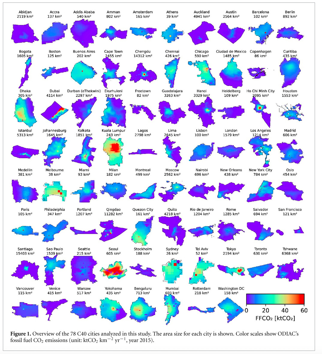
In this open-access letter, we look at a comparison between three different types of emission calculations. In this letter, they aim to understand how citywide emission inventories compare with global gridded data from satellites and other simulated data sources. They focused exclusively on C40 cities.
Currently, cities that participate in the C40 movement use something called the Global Protocol for Community-Scale Greenhouse Gas Emission Inventories to track their city-scale emissions. The researchers compared the CO2 estimates developed from this protocol to two research-based, gridded carbon dioxide datasets.
Why?
I think there’s a disconnect between modelled data from the research community and the values presented by governments, as we’ve seen in other comparison-based papers (refer to my post on emissions in the mining sector for another example of this).
These are the two gridded datasets:
1 : EDGAR: Emission Database for Global Atmospheric Research
EDGAR is developed using energy data from the International Energy Agency
0.01-degree global grid
2 : ODIAC: Open-Source Data Inventory for Anthropogenic CO2
ODIAC is a downscaled model of fossil CO2 emissions from the Carbon Dioxide Information Analysis Center, which uses “energy statistics” data from the United Nations (this part was a little vague).
They use nightlight imagery as a proxy for non-point sources (i.e. the more electricity on at night, the more emissions in that area)
1 square-km spatial resolution
Comparing the three datasets
The research team wanted to compare the three datasets temporally, spatially, and by sector. Here’s an overview:
Sector
They included fossil-fuel CO2 emissions from five sectors:
residential
commercial
industrial
energy
transportation
Temporal
The gridded data (EDGAR and ODIAC) both have data from 2014 to 2018.
They uses cities with emission inventories that had this same temporal range, which consisted of about 74 out of the 82 cities
They also want to compare change over time, so they used each city's earliest and last accounting year.
Spatial
They aggregated the gridded data by the geographic boundaries of each municipality. They scaled the EDGAR data by the ratio of the grid area within the city boundary to the grid area of the 0.1-degree grid cell. For EDGAR they just used the centre point, with no area-based scaling.
So how did the three datasets compare? Here’s an overview of the results:
The energy and transportation sectors contributed up to 17% and 51% of fossil fuel CO2 emissions, respectively.
CO2 emissions have a scaling relationship with population, area, and population density
Cities that have power plants within their boundaries have higher Scope 1 emissions
However, EDGAR had a better correlation with city-wide emission estimates than ODIAC, but they were both pretty good (R2 = 0.8 for EDGAR and R2 = 0.72 for ODIAC)
Only 25 out of the 46 studies had decreasing CO2 emissions, the rest saw an increase
There were major discrepancies between gridded and reported CO2 emissions in Amman, Jordan. They did not have power plant emissions included in their inventory, but both EDGAR and ODIAC had the associated emissions within their datasets, resulting in large differences between the reported and gridded data.
However, the correlation across the three types of data varied based on a couple of factors:
Quality of emission factors.
The size of the city
How can we improve the correlation between these datasets with the following:
Using local, up-to-date emission factors when conducting city-wide emission inventories
Incorporating satellite data when modelling gridded CO2.
I thought this was a good read, but I’m curious to understand how this work can be applied to actually improve GHG quantification at the municipal level. Thoughts?
That’s it for this week! Subscribe to get summaries in the future.
Is EO data the solution to comparable GHG tracking across cities? Can they make current methods more accurate? What do you think?


Wow, I can't believe you had to work for free! What an audacity!