Examine the impact of land surface temperature on heat stroke incident rates using MODIS data
A case study in Japan
Thanks for reading Earthbound! This publication is dedicated to providing subscribers with short summaries on the latest research in earth observation, techniques on how to use R and Python for data science, as well as simple breakdowns of spatial data science concepts. If you haven’t already, subscribe to learn more:
I picked this paper because one of my readers told me she was studying the relationships between people and their environments. I think this paper is a great example of the enormous impact urban design can have on the health of sensitive populations in our cities.
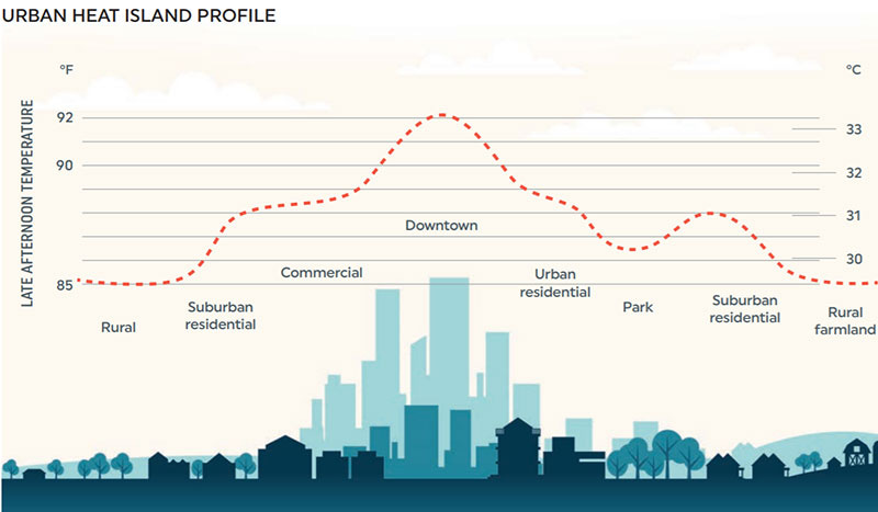
By 2050, a majority of the world’s population will live in an urban city. As climate change continues to worsen, there will be an increase in extreme heat events across the world. In urban areas, these heat events are magnified through the urban heat island effect, and in areas with older or elderly populations, this needs to be addressed and accounted for in urban design tactics as these events can pose a serious health risk for those without access to sufficient cooling systems or centers.
So, can we track the areas where sensitive populations are most at risk? Well, in this study, a research team from the University of Tokyo compare the land use temperature data and incidents of heat stroke across the Tokyo Prefecture from 2010 to 2019. This paper was published in Sustainable Cities and Society and can be found at this link.
Land surface temperature
They used land surface temperature from the Moderate Resolution Imaging Spectroradiometer (MODIS). This instrument provides daily land surface temperature data at a 1 km2 resolution.
The research team makes a point of explaining why they chose MODIS over Landsat, which also provides land surface temperature data. They chose MODIS for two reasons:
MODIS provides daily measurements, whereas Landsat’s temporal resolution is every 16 days. This is important as it can heavily impact the number of usable pixels within your study area. Cloud cover and other seasonal effects heavily limit the data availability in remote sensing datasets.
There is precedent from other land surface temperature data studies that conducted similar health studies using MODIS rather than Landsat
They averaged the land surface temperature data from MODIS across a seasonal period (July to August) and they used the median value to account for anomaly temperature data. So each pixel in the final temperature dataset represents the median land surface temperature from July to August between 2010 to 2019. You can see the final data plotted in the following image:
NDVI
They also wanted to compare the differences in land surface temperature and urban land cover. To do this they used NDVI data from Landsat 8 and MODIS to track urban development in this area. NDVI is a vegetation index, and it’s calculated using values from the near-infrared and red bands.
The values for NDVI ranges from -1 to 1 and the paper provides a very helpful explanation that I’ll reference here word for word:
“As a general rule, negative values represent liquid water or snow, zero values represent the exposed ground, and positive values represent the presence of vegetation” (O’Malley et al., 2021)
Heat stroke and population data
They also need information on the number of people who were reported to have heat stroke incident rate information. They used heat stroke incident rate data from Japanese Fire Disaster and Management Agency (FDMA) and daytime population data from the Tokyo Metropolitan Government Bureau of General Affairs Department of Statistics (2020) in. They used these datasets to calculate the number of heat stroke incident rates across the study area.
Results
So what did they find?
Well, they first used NDVI to identify rural vs. urban areas and compared these areas with the LST values. Unsurprisingly, they found that areas with rural, less developed areas had a lower median LST than more developed areas.
There was a positive correlation between the incidents of heat stroke and proportion of elderly populations.
They compared the heat stroke incident rates with the land surface temperature. This part was interesting because the results were inconsistent. For example, the ward with the lowest land surface temperature had the highest rates of heat stroke - see the following image:
The ward with the highest land surface temperature had the lowest rates of heat stroke. The authors use this to indicate that other factors are impacting the incident of heat stroke (ex. Access to cooling centers).
However, there were positive correltaions between land surface temperature and heat stroke incident rates within the central wards.
The interesting point to note here is that there were stronger correlations between LST and HSIR in urban areas vs. rural areas – why do you think that is?
The paper also provides a few strategies for mitigation, including shading, greenery, and cool material, as they all create a decrease in urban temperatures. I recommend this paper for anyone looking for a basic methodology on how to examine the impact of urban design on land surface temperature.
That’s it for this week – thanks again for reading!


Hey Priya! Thank you so much for this paper!!! It’s perfect!
I think the correlation in urban areas might have to do with material composition, density of people and buildings, and vegetation. In urban areas, artificial surfaces and high density areas continue to release heat at night, which raises ambient temperatures and reduces evaporative cooling. Kind of like covering yourself with a blanket when you’re cold. The blanket helps prevent more of your body heat from escaping into the air.
Thanks again. ☺️