Plot air pollution in your city using Google Earth Engine
A few lines of code can help you visualize air pollution in your city.
I recently launched a new EO platform for anyone who wants data without wanting to deal with coding. You can check it out at accessearthdata.com
Google Earth Engine is great for anyone who’s new to remote sensing and wants a easy-to-use platform to play with data. This article will walk you through how to create a visualization of nitrogen dioxide (a traffic-related pollutant) over my city (Toronto). To change the location to your city is very simple and easy to do.
First, find a shapefile of your location (in my case, Toronto) and download it. Most cities (at least the bigger ones) should have an open data platform where you can download boundaries of your cities. I downloaded my data from the Toronto OpenData portal.
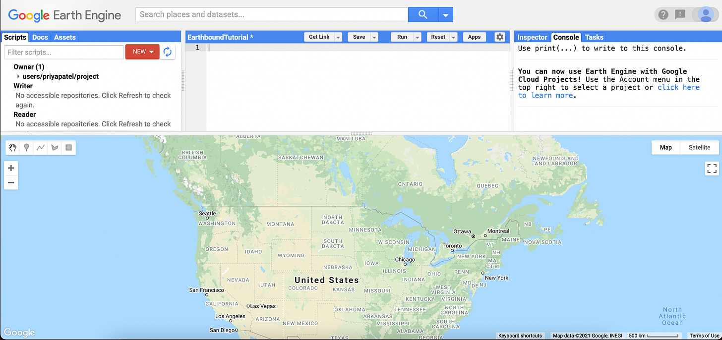
Open up a new Google Earth Engine script (if you don’t have an account you’ll have to make one)
Import it into the Google Earth Engine assets section by clicking Assets > New > Table Upload > Shape Files
Import the shapefile of your city into Google Earth Engine. Depending on the size, this may take a couple of seconds.
Once this is done, you will see it in your list of assets. Hover over the name of your asset and click the small arrow that shows up.
This will import the shapefile into your script as a variable. Then we can write some code to turn it into a feature collection and add it to our map.
The code will look something like this:
var toronto = ee.FeatureCollection(toronto); Map.addLayer(toronto,{},"Toronto");Once that’s done, click Run.
Here you you can the shapefile of Toronto imported into Google Earth Engine. Once that’s done, we want to select the pollutant or remote sensing dataset of interest. You can see their entire collection here, but I’m going to be plotting nitrogen dioxide from the TROPOMI instrument. The great thing about Google Earth Engine is that you can pretty much import the code directly into a new script by clicking the arrow next to the “Earth Engine Snippet.”
However, we are going to type it out like this:
var no2 = ee.ImageCollection('COPERNICUS/S5P/OFFL/L3_NO2').select('tropospheric_NO2_column_number_density').filterDate('2019-01-01', '2019-04-30')With the code above, we have created a variable for the tropospheric nitrogen dioxide column number density from January 1, 2019 to April 30th, 2019. You can change the date to whatever timeframe you’d like, and if you want to see a different pollutant you can change the ImageCollection or product name.
Next, we want to calculate the mean for the time range that we’ve selected and clip it to the shape of our city.
var no2_data = no2.mean();
var study_area = no2_data.clip(toronto);
Then, you can create a colour palette for the range of values for the nitrogen dioxide variable.
var band_viz = {
  min: 0,
  max: 0.0002,
  palette: ['black', 'blue', 'purple', 'cyan', 'green', 'yellow', 'red']
};
The code above sets a minimum and maximum value of 0 and 0.0002 respectively. You can also change the palette to a different order of colours, or change the colours entirely.
Finally, you add the layer to your map, and you’re done!
Map.addLayer(study_area, band_viz, 'S5P N02'); Click run, and you should see a map of nitrogen dioxide (or whatever variable you chose) for your shapefile. Mine looks like this:
Good luck! Feel free to reach out if you have any questions. And if you’re interested in more tutorials like this, click the subscribe or share button!
If you want to download the underlying data and don’t want to use Google Earth Engine, we can prepare it for you. Just fill out this Google Form:


